KNOWUNITY VOICE RECALLBridging the gap between recognizing and recalling
Designing a voice-based active-recall step for a studying app's Exam Plan, where 82% of students completed it by voice instead of falling back to text.
ROLEProduct Designer
DURATION3 weeks
TOOLSFigma, Notion, Claude Code, Next.js Vercel
TEAMSolo Designer
IMPACT82%
of test sessions completed by voice rather than the text fallback
74%
completion rate for the full recall step
Students finishing practicing a session feeling like they know it, but recognizing an answer isn’t the same as producing it from memory. Nothing in Knowunity’s Exam Plan asks a student to retrieve and say a term before the real exam does.
CHALLENGEBuild out an optional voice-based active-recall step inside the Exam Plan. The student explains a key term out loud and the app replies in text confirming what's right, while nudging with a hint on what's missing, and never letting a wrong turn become a dead end.
SOLUTION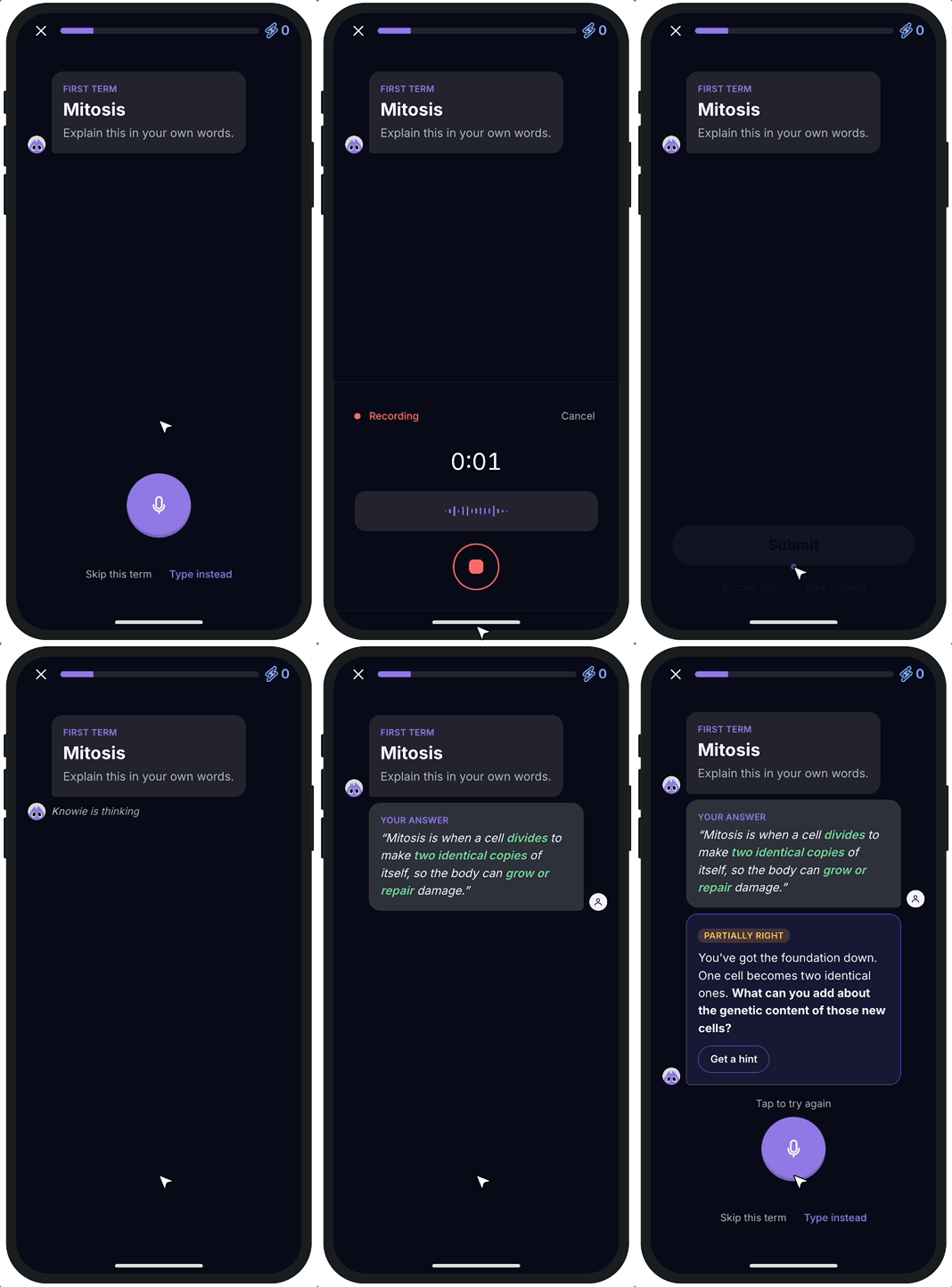
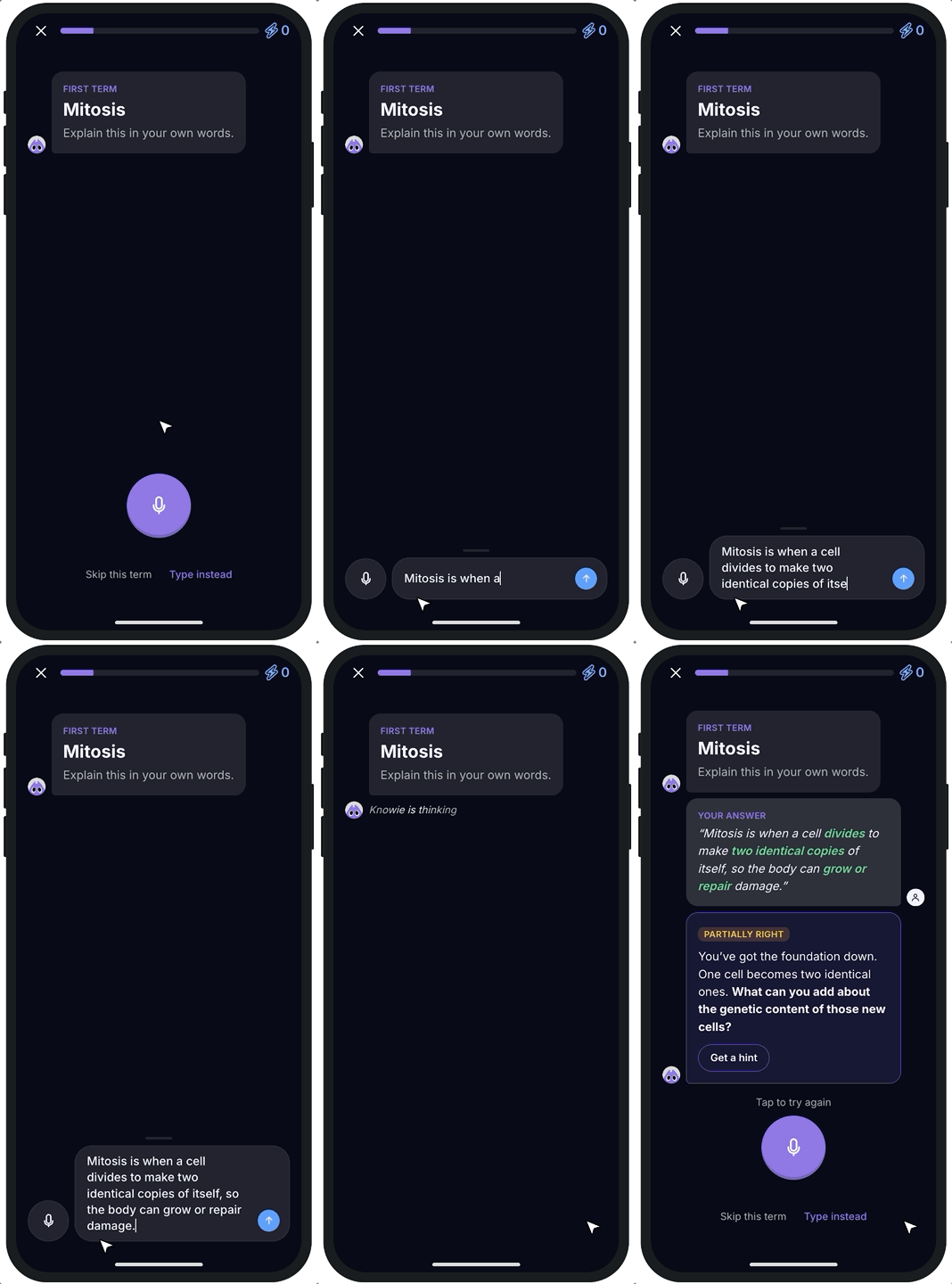
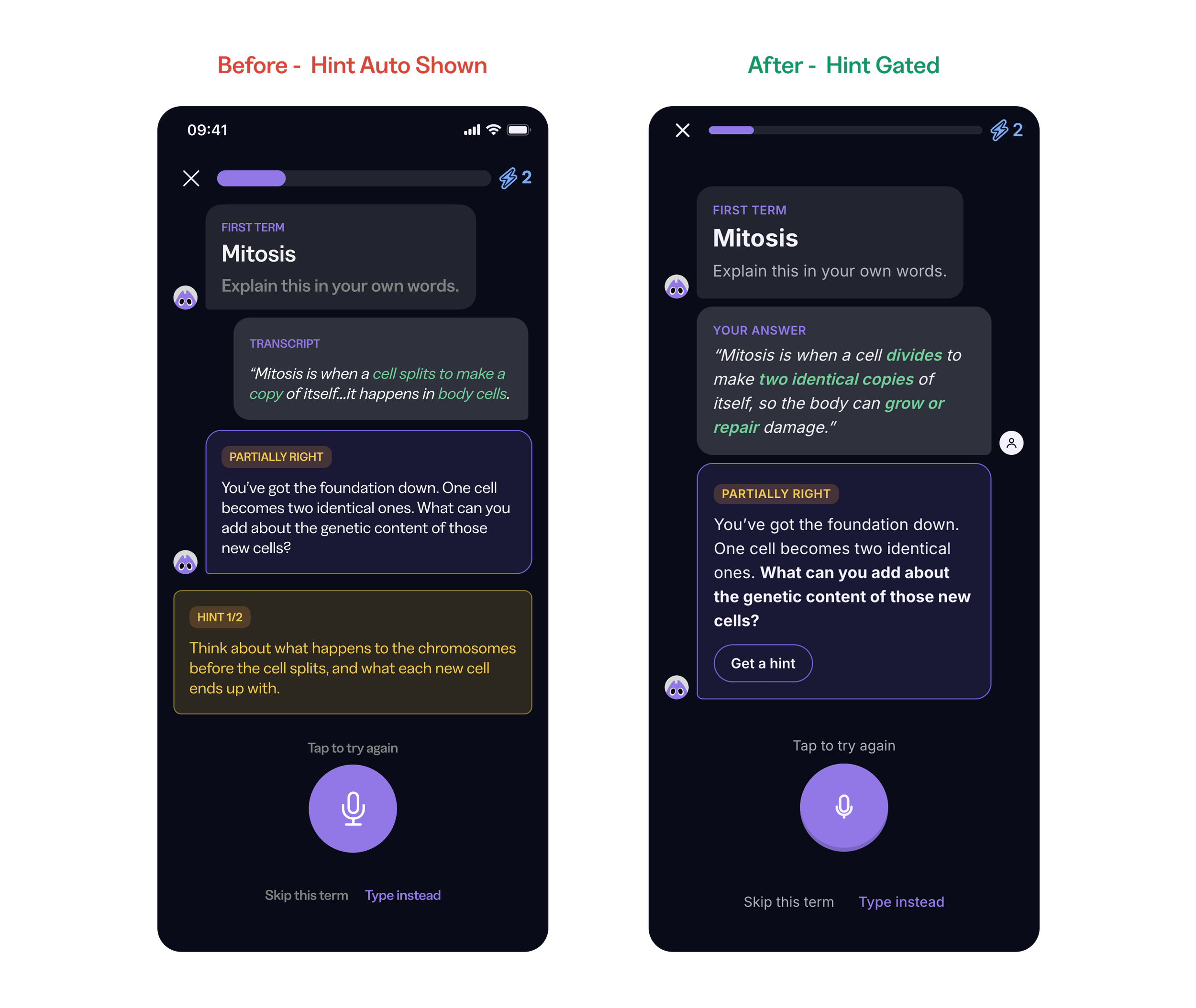
KEYS TO SUCCESSI gatekept hints for better retrieval.
The first version showed the hint right alongside a partial result, and testers just read it and repeated it back instead of trying to recall. I moved the hint behind a "Get a hint" tap, so a genuine second attempt by recalling can take place.
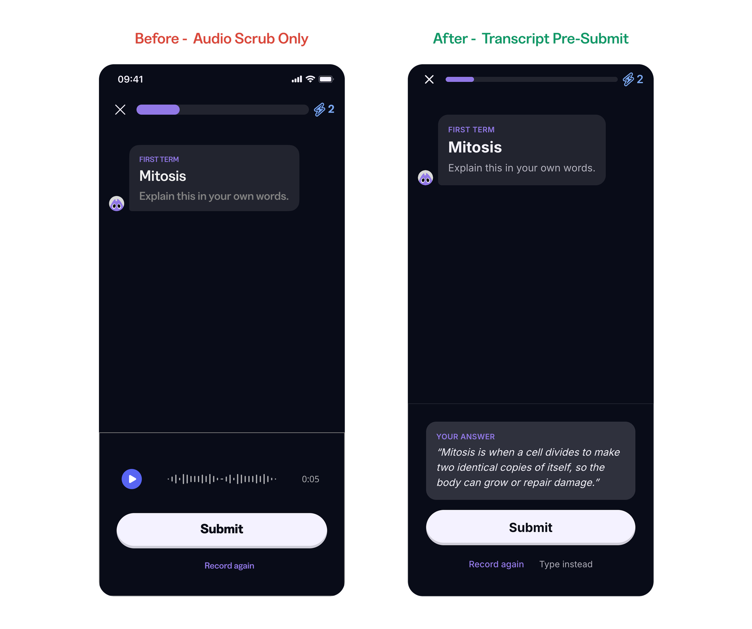
I surfaced student's transcripts before submitting answers, not after.
Testers hesitated to submit answers they couldn't see, and some defaulted to typing to stay in control. A read-only transcript before submit removed that anxiety without giving them anything to game, keeping voice the primary path rather than a fallback.
I accounted for multiple pathways so there were no dead ends.
Every screen keeps skip, retry, and a one-tap "Type instead" fallback available. A student on a train, in a shared room, or just blank on an answer always has a way forward instead of getting stuck or dropping out.
LEARNINGSLanguage matters more with a younger audience.
It’s more likely that a younger person who is told their answer is wrong won’t try harder, they’ll skip and move on. Partial answers lead with what they got right, and negative language is never used even when the correct answer has to be fully revealed.
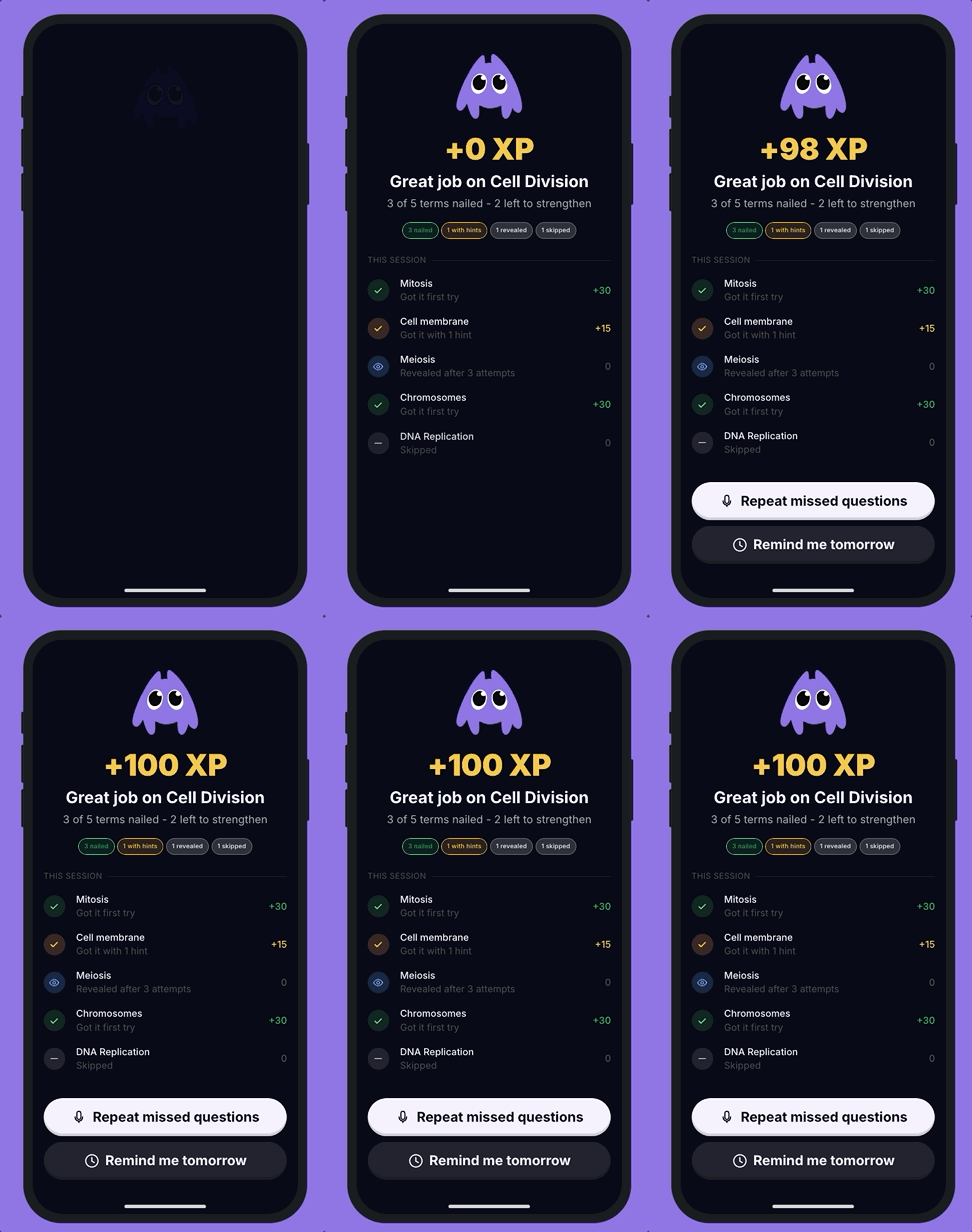
Rewards are less important than the achievement.
The XP number was originally big enough to pull focus away from the actual result. Toning down the XP let the real achievement lead, and users could better prioritize what they still needed to work on in the session.
Designing for practice ≠ designing for a test.
The concept only works if students don’t feel they’re being graded. Having real accountability with zero pressure was the tension that shaped the entire design: generous scoring, guided hints, and no blocked paths.
THE LARGER STORYKnowunity helps students revise through an "Exam Plan" of flashcards, quizzes, and videos, guided by its mascot Knowie. This sprint added one step: instead of re-reading a term, students now say it out loud, and Knowie replies in text. Here's how that idea came about, got picked, built, and refined through testing.
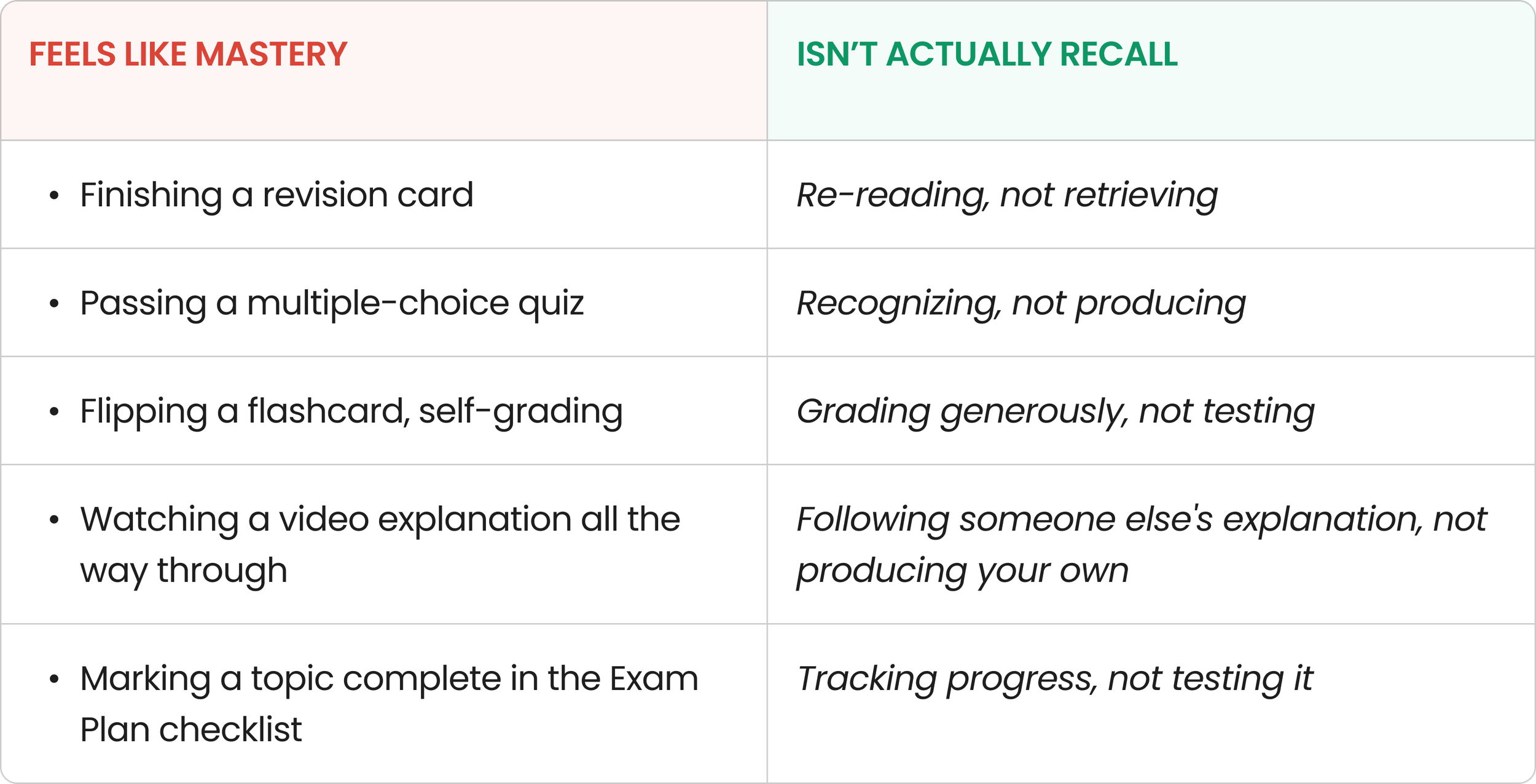
The illusion of mastery
I audited the Exam Plan for moments where students feel they know something without truly retrieving it: finishing a card, passing quizzes by recognition, or self-grading flashcards too generously. These all build false confidence, since only recalling an answer cold actually tests real understanding. Nothing in the existing flow did that.
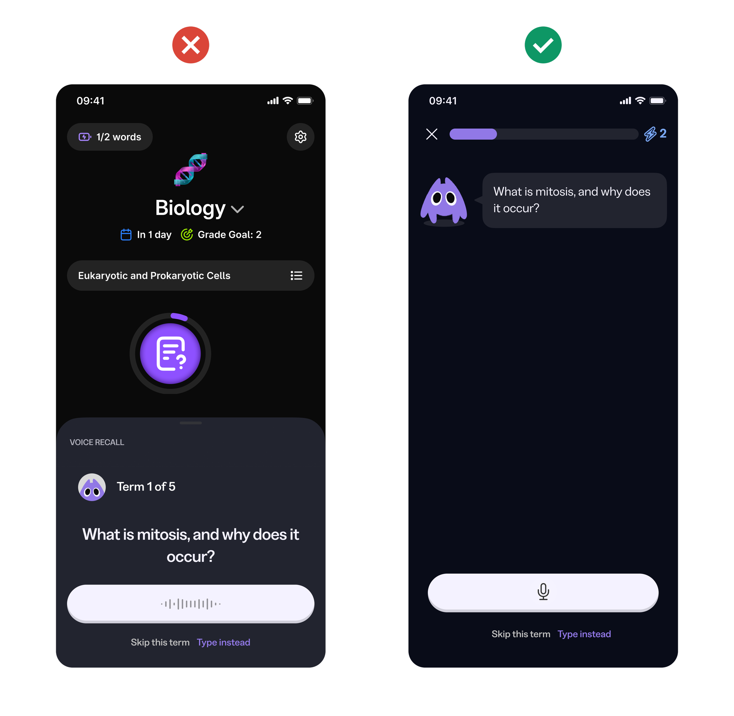
Choosing a concept
I storyboarded two directions and stress-tested each against the can't-speak path. Concept A was a standalone bottom sheet for practicing, while concept B was an in-path, hint-laddered step. The bottom sheet lost the students who needed it most by living outside the Exam Plan they were already in. The in-path version won because it kept retrieval part of studying, not a separate exercise bolted on beside it.
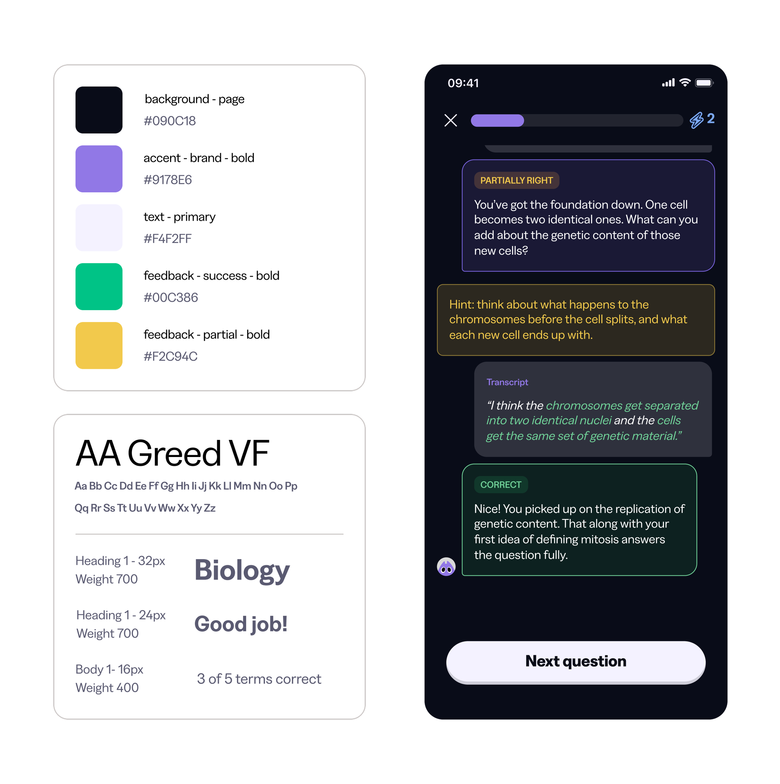
Designing inside Knowunity’s system
Rather than inventing a new visual language, I extracted the real Knowunity design system (colors, type, spacing, radius, and how Knowie's mascot and card/list patterns actually compose) directly from Knowunity's Figma file, and built every new screen (the mic affordance, the recording and result states, the hint ladder) as an extension of that system, not a graft from a different app.
Building with AI, not just designing with it
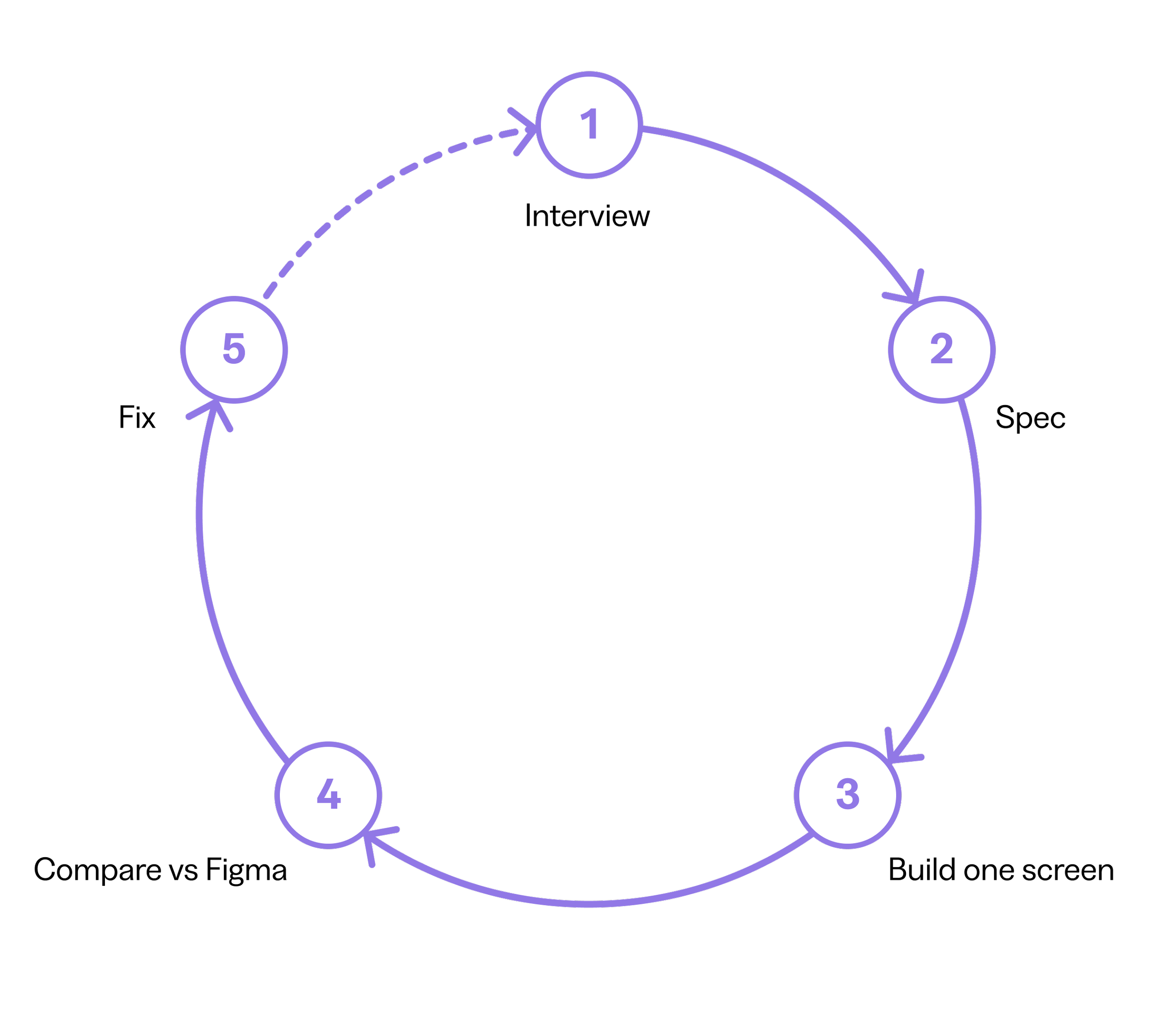
The prototype was built with Claude Code rather than hand-coded screen by screen. First, Claude interviewed me to turn the flow into a written spec, forcing decisions on edge cases (misheard transcripts, empty recordings, network errors) upfront. Each screen was then built against design tokens pulled from Knowunity's real Figma file and checked side-by-side until it matched. The result: a working Next.js prototype on Vercel, built in days, that stayed true to the real design system instead of drifting into generic AI-generated UI.
Testing and what changed
User testing surfaced two key fixes. First, the hint ladder didn't actually ladder: showing the follow-up question and hint together meant testers skipped straight to the hint, skipping retrieval. Gating the hint behind a tap fixed this. Second, testers wanted to review their transcript before submitting, not after; showing it only post-processing felt like a loss of control. Moving it earlier resolved that. Smaller fixes followed: clearer chat bubble attribution, switching hold-to-record to tap-to-record after testers fumbled the gesture, and dialing back the XP moment so studying stayed the focus.