
Ever Skincare
Ever is a skincare line that falls under Stella & Dot’s family of brands. Ever Skincare commits itself to sourcing their ingredients from ethical, trusted suppliers held to the highest standards of production.
Role & Responsibilities:
improve cart layout to ease user funnel into checkout
create upsell pathways to decrease dead end situations on the site
improve shopability of skin quiz results page
Product Team
Alejandra Meza - UX Design Director
Sarah Tolani - Product Designer'
My Role
Product Designer
Sticky Cart
Prior to this project, a user who was trying to checkout or add discounts would have to scroll down to the bottom of the page to see how item changes or promotional codes would affect their subtotal. My main challenge was to compile an order summary that would always be in a user’s view space in order to reduce scrolling and friction.

Iterations on the sticky cart.
After some collaboration and feedback, we decided to nix the box outline and include a light grey fill to have the cart visually feel more connected to rest of the content on the page. We also decided to give the user only the checkout CTA to drive customers to convert rather than bouncing between product pages and distracting them.

The user flow of adding and removing products to the sticky cart on the right.
Upsells
In addition to the upsell section on the sticky cart, the concept was also implemented into a few other regions of the site as well. I added upsells to two aspects in particular: specific product pages and to the “no search results” when a user tries to find a product that isn’t found on Ever.
All product pages have 4 dropdown tabs of information, which if opened all at once could lead to a pretty long and text heavy page. Realizing that if a user were to have all tabs open to read all product related material, they get further away from the original add to bag CTA. If it’s out of sight, it’s out of mind. The upsell in this case was meant to resolve this scenario with more “grab and go” items with a secondary add to bag CTA in a hover state. Along with having another actionable item at the bottom of the page to aid in user conversion, the upsell section functioned as well to remind a user of their original purpose on the product page, focusing their attention back up to the original Add to Bag CTA at the top of the page.

An example of a product page with the upsell section underneath. The Add to Bag CTA exists in a hover state.
In the case of the “no search results” page, it became apparent that the likelihood of a user not finding a product through the search field would most likely lead to abandoning the site. To counter this, I added an upsell section so users would have another pathway instead of running into a dead end.

The upsell section on desktop for no search results.

The upsell section on mobile for no search results.
Skin Quiz Results
One of Ever’s biggest sellers is their skin regimen, which is a set of 4-5 products that addresses specific skin issues provided by the user. How a user typically provides this information is in the form of Ever’s Skin Quiz. It’s a slew of questions ranging from how old a user is to how many breakouts they typically have. Once the quiz is finished, a results page will show up with a personal regimen detailing what every product addresses based off the quiz answers.

The first question of the skin quiz.

The third question of the skin quiz.
The results page, however, housed some pain points that needed to be addressed. First, and probably most important, the Add Regimen to Bag CTA existed a ways below the fold, posing a fairly big issue with converting users on the regimen who were more likely to bounce off the page. Second, the list of regimen products was fairly long and clunky, with an awkward layout as well as several opposing text styles. Third, there was no way for a user to quickly add individual items from their regimen to their cart; they would have to go to the individual product page and leave the results page, which led users away from the intended goal of aiding conversion by clicking on the Add to Regimen CTA.

The flow of scrolling through the skin quiz results page.
My plan from here was to whittle down the top of the page information so the Add to Regimen CTA sat above the fold, reduce the copy on the individual products to condense the page, and to add individual Add to Bag CTA’s to all the regimen products.
Probably the most perplexing problem of the three was identifying what solution made sense for displaying product information on the individual steps of the regimen. The original layout consisted of the name of the step (i.e. cleanse), the name of the related product (i.e. luminous), and when it should be used (i.e. am or pm) with the price and a small description falling under those three identifiers. What threw me most about this original layout was that the step name, product name, and when to use said product all had different font styles. This left the product blocks with a jumble of opposing font sizes and widths that didn’t particularly adhere to a known hierarchy of importance, which was fairly off putting.

Iterations on individual product layout from the regimen.
After a few rounds of iterations and feedback, I moved the step name under the number to give more prominence to the actual name of the product. The price was given more weight so the user’s eye could point out how much a product cost given all of its surrounding information. The pink icons from the quiz in itself were recycled back into the product blocks for an added frame of reference and to notify users of what a particular product in their regimen addressed based on their answers from the skin quiz. Lastly, the Add to Bag CTA was changed to an outline instead of a fill to mark it as a secondary CTA since the main purpose of the page was for users to click on the Add to Regimen.
To address the rest of the page layout, the Add to Regimen CTA was pushed up as high as possible so it sat above the fold in case a user didn’t scroll down the page. Since the products of the regimen are listed out in their respective steps, it didn’t make much sense to have a big hero image of the regimen that took up the entire page and to take attention away from the main goal of the quiz results page. I reduced the size of the regimen image and shifted the CTA so the two blocks laid horizontal, allowing the regimen CTA to sit higher than the original. The products, too, were condensed into a 3x2 layout to decrease the page size and to have a bit more order than the original page. In this way, a user could gain a more holistic view of the regimen as well as allow the products in the “Amp your Regimen Results” section to have more visibility.
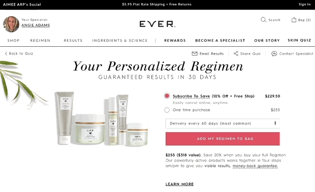
The redesign of the skin quiz results page on desktop.

The redesign of the skin quiz results on mobile.